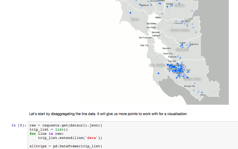
Below you'll find my Ipython notebook, which contains a lot of the thinking that went in to the visualisations for Jakarta traffic.
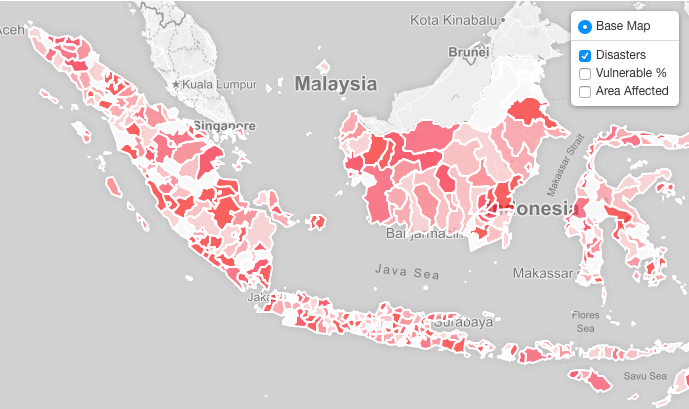
You'll also find a map of disasters and hazard exposure in Indonesia.
For the hazard map, I tried to choose a visual design that allowed you to turn on more than one layer at once and get some useful visual information about how (e.g.) hazard exposure and loss of life are correlated (or not, as the case may be).
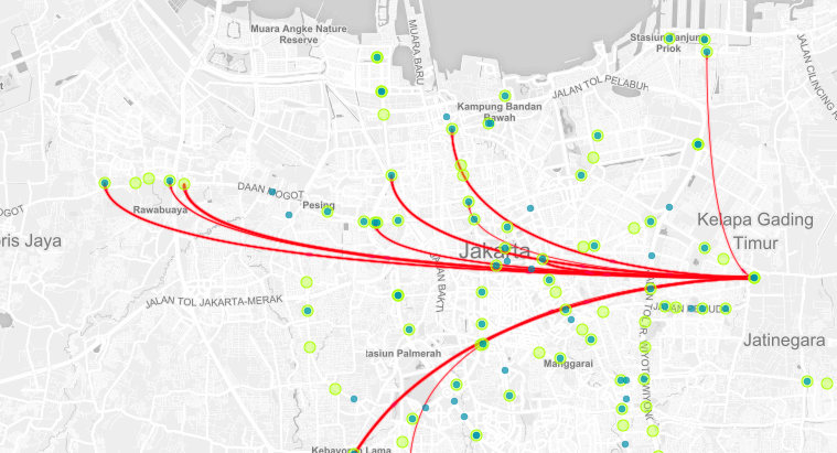
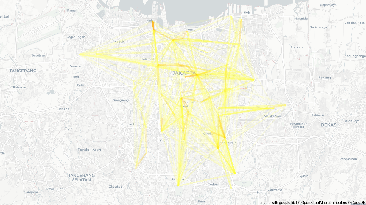
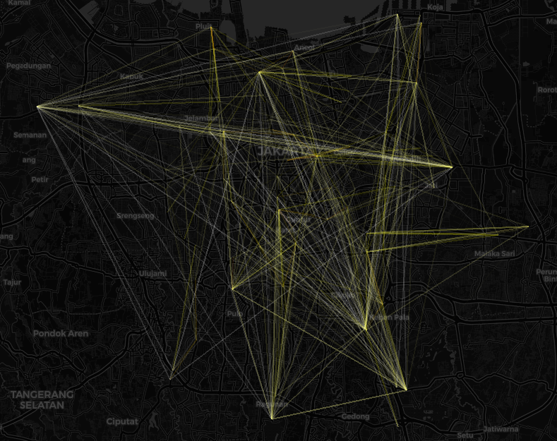
For the Jakarta traffic dataset, I've included a few different visualisations: A Chord style graph visualisation, two static geo-visualisations of people movements and one interactive flow map.
I think all of them provide some useful data, although with more time i think we could find a "nod along" visualisation, one that uses data to tell the data owner something they didn't already know.
Geocoding the Jakarta bus stops proved to be a bit of a challenge - Although Google clearly has great data, it's not always easy to get the result you want from the geocoding API. The code I've written to filter by location type (transit station / bus station) seems to do a good job now, but 7 stops weren't geocodable.

Some selected graphs and notebook