UN Global Pulse Take Home Assignment
I'll keep this notebook as a running diary of my exploration of the data. Hopefully it will give you some insight in to my thought process and work habits
Project 2: Graph Visualization
Typically, I'll divide projects in to 3 phases: Exploratory Data analysis, early draft and then client feedback / iteration
Step 1: Explore the Data
%matplotlib notebook
import pandas as pd
import requests
import time
dataurl = 'http://139.59.230.55/frontend/api/odpair'
travel = pd.DataFrame(requests.get(dataurl).json())
travel.head()
OK, so this appears to be a graph of people travelling between a set of destinations. I'm not sure what 'Lines' is referring to, possibly rail or bus lines? I'll ask.
First thoughts are:
- Assuming this is a representation of rail or bus lines, it may be most helpful to do it as a geo-visualisation - Planners are likely to be familiar with their own city, and seeing fat / thin lines on a map is probably the most intuitive way to understand this data.
- A particle simulation animation ala SimCity might be cool too, but maybe out of scope for this depending on time constraints (http://bigbytes.mobyus.com/commute.aspx)
Let's start by disaggregating the line data. It will give us more points to work with for a visualisation
raw = requests.get(dataurl).json()
trip_list = list()
for line in raw:
    trip_list.extend(line['data'])

alltrips = pd.DataFrame(trip_list)
OK, so that's the disaggregated trip data. Now we'll need to geocode those stations.
from geopy import geocoders
g = geocoders.GoogleV3(api_key='AIzaSyAq8t-hz_DRUcQaM5an1FQCDoMvUtvKOO0',timeout=2)
from tqdm import tqdm_notebook, tqdm

tqdm_notebook().pandas(desc="progress")
backoff = 2 # Set a 2 second delay for Geocoding (global so we can parallelize this)
def getgeo(location):
    global backoff #If we decide to parallelize this
    locationstring = str(location) +" busway"
    try:
        loclist = g.geocode(locationstring, exactly_one=False,region='ID',bounds=[106.3903, -6.3725, 106.9743, -5.2017])
        for loc in loclist:
            if ('transit_station' in loc.raw['types']) or ('bus_station' in loc.raw['types']):
                #Only return the co-ordinates if Google thinks it's a bus stop
                return (loc.latitude,loc.longitude)
    except Exception as e:
        print(e) # TODO - Better exception handling.
        backoff = backoff * 2
        time.sleep(backoff)
        return
station_list = list()
station_list.extend(alltrips['from'].values)
station_list.extend(alltrips['to'].values)
station_list = list(set(station_list))

geolocs = pd.DataFrame()
geolocs['station'] = station_list
geolocs['latlon'] = geolocs['station'].progress_apply(getgeo)
geolocs[geolocs['latlon'].isnull()]
There are 7 stations we can't find a lat-lon for.
If we weren't time constrained, we'd hand-code these or write a better geocoder. For the purposes of this exercise, we're just going to throw away trips to and from those stations and visualise the rest
def geolookup(station):
    try:
        return geolocs[geolocs['station'] == station]['latlon'].values[0]
    except Exception as e:
        print(e)
        return

alltrips['from_latlon'] = alltrips['from'].apply(geolookup)
alltrips['to_latlon'] = alltrips['to'].apply(geolookup)
Step 2: Preliminary Visualisation
alltrips = pd.read_pickle('alltrips.pickle')
alltrips = alltrips.dropna()
from bokeh.charts import output_file, Chord
from bokeh.io import show, output_notebook
output_notebook()
chartframe = alltrips[['from','to','count']][alltrips['count'] > 6]
chartframe = chartframe[chartframe['from'] != chartframe['to']]
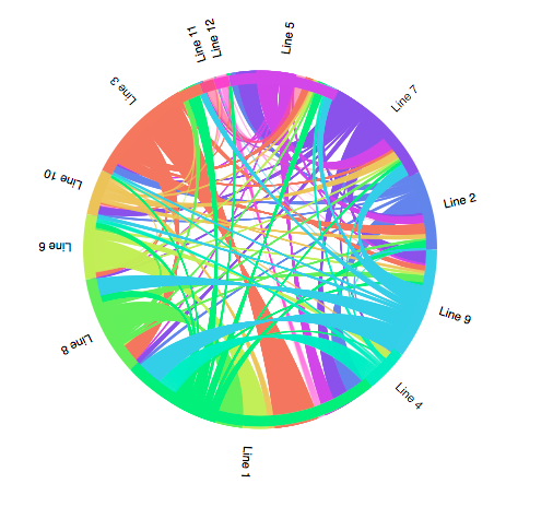
all_trips_chart = Chord(chartframe, source="from", target="to", value="count")
show(all_trips_chart)
output_file('chord.html')

The disaggregated data is rich, but this chord diagram is a bit overwhelming. It also doesn't take in to account spatial relationships between stops.
Just for reference, here it is aggregated by line, as it came out of the api
lineframe = travel[['from','to','count']][travel['count'] > 0]
shortframe = lineframe[lineframe['from'] != lineframe['to']]
linechart = Chord(shortframe, source="from", target="to", value="count")
show(linechart)
Easier to read, but not necessarily any more informative
Step 2.5 - Using the GeoData
alltrips = pd.read_pickle('alltrips.pickle')
import geoplotlib
%load_ext autoreload
%autoreload
geoplotlib.set_window_size(1200,1200)
geoplotlib.tiles_provider('darkmatter')
First, some light data processing to turn each trip in to a single row for visualisation
alltrips['from_id'] = pd.Categorical(alltrips['from'])
alltrips['from_id'] = alltrips['from_id'].cat.codes

alltrips['to_id'] = pd.Categorical(alltrips['to'])
alltrips['to_id'] = alltrips['to_id'].cat.codes

alltrips[['from_lat', 'from_lon']] = alltrips['from_latlon'].apply(pd.Series)
alltrips[['to_lat', 'to_lon']] = alltrips['to_latlon'].apply(pd.Series)
alltrips.to_csv('test.csv')
trip_list = list()

for row in alltrips.iterrows(): # Iterating over rows is usually slow, but this avoids having to fill missing fields to vectorize
    for i in range (1,row[1]['count'] + 1):
        newrow = row[1][['from','to','from_lat','from_lon','to_lat','to_lon','from_id','to_id']]
        trip_list.append(newrow)

one_trip_per_row = pd.DataFrame(trip_list)
one_trip_per_row.to_csv('newtest.csv')
Now we're ready to visualize the individual trips
geoplotlib.graph(one_trip_per_row,
                 src_lat='from_lat',
                 src_lon='from_lon',
                 dest_lat='to_lat',
                 dest_lon='to_lon',
                 color='hot',
                 alpha=4,
                 linewidth=2,)
geoplotlib.inline()

geoplotlib.tiles_provider('positron')
geoplotlib.graph(one_trip_per_row,
                 src_lat='from_lat',
                 src_lon='from_lon',
                 dest_lat='to_lat',
                 dest_lon='to_lon',
                 color='hot',
                 alpha=24,
                 linewidth=2,)
geoplotlib.inline()

geoplotlib.savefig('jakarta2')
That's looking more informative. It shows travel destinations clearly (although it's currently not weighted by the number of trips. Still to do:
- Lines weighted by # of trips
- Labels
- Interactivity / filterability
Step 3 - Interactivity Prototyping
![Interactive Prototype] (https://anthonymockler.github.io)